Rescue Remedy Survival Kit
Services:Packaging DesignVisual Identity
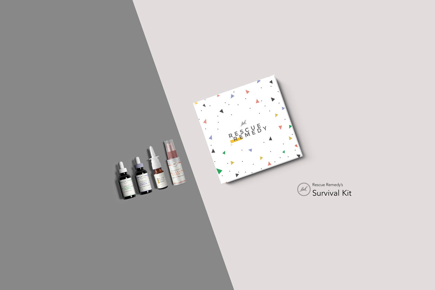
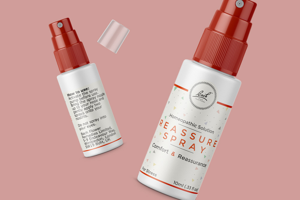
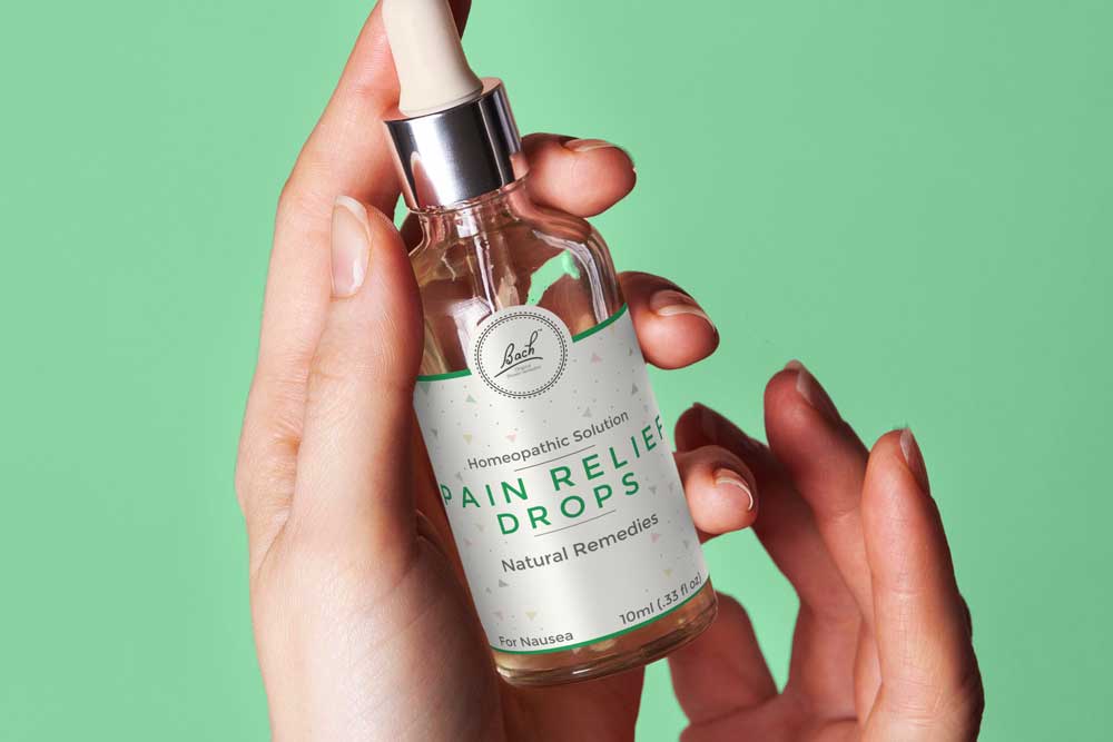
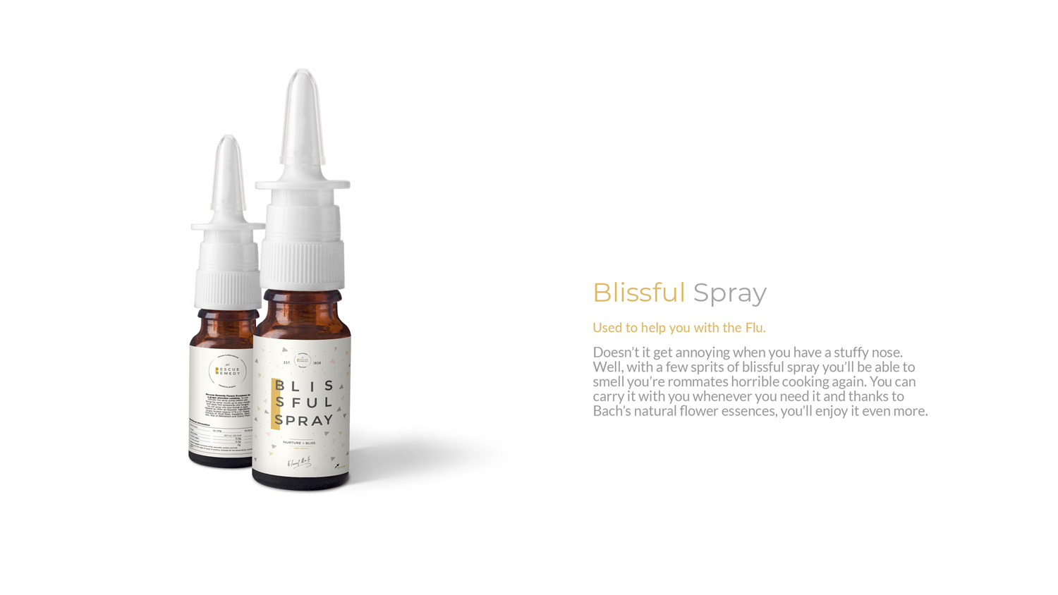
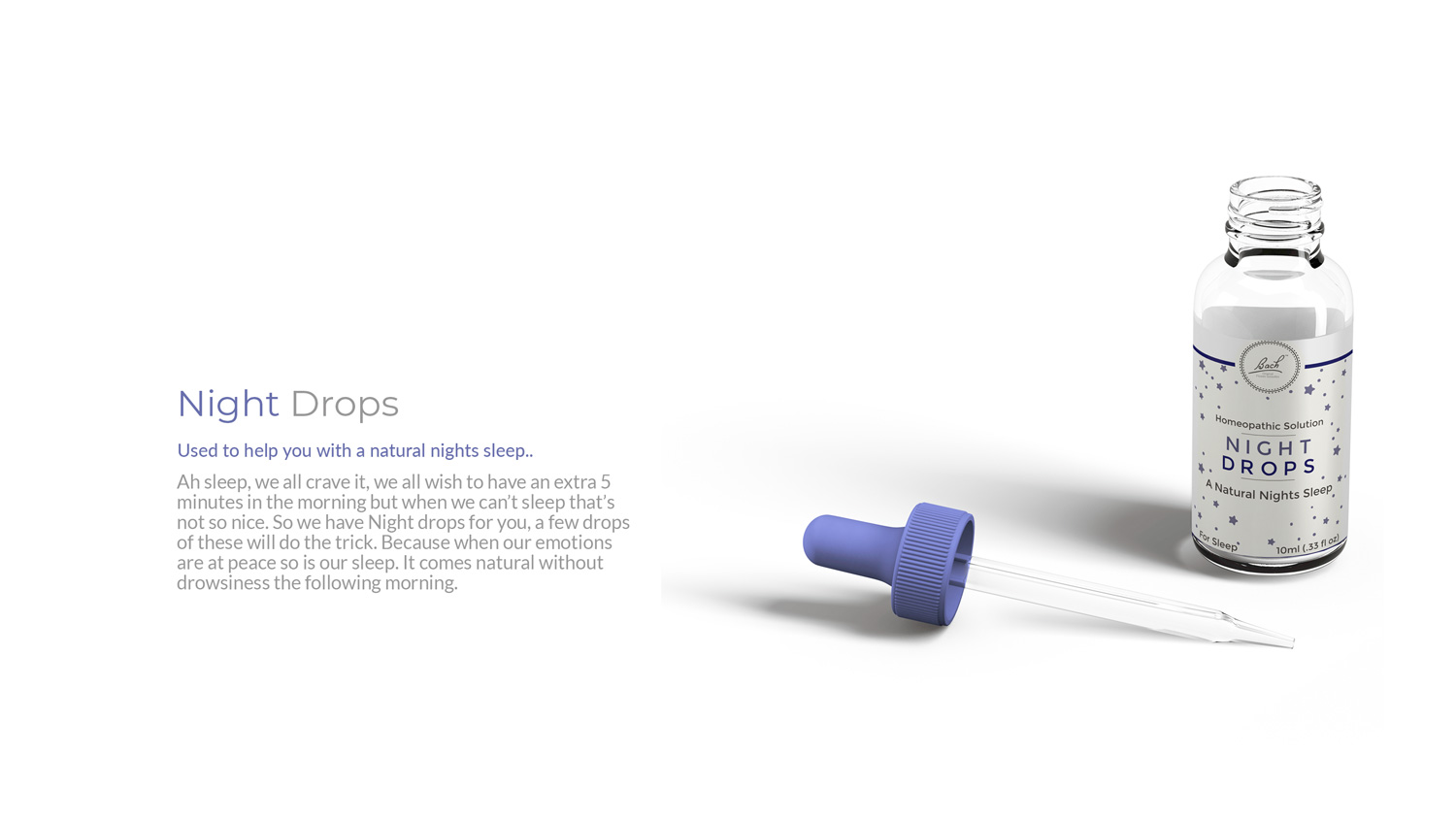
Providing a fresh, vibrant and fun approach to the Bach Branding. The aim for this project was to give a new/modern twist, looking for new ways to connect with a new target audience (in this case students), highlighting the advantages of using the natural remedies of Rescue Remedy as opposed to the alternative – medicine.
This page will conclude the passion that had gone into building the final artefact for the project and exhibit my take on the redesign through my packaging.
*There is no collaboration or involvement of the designated brand in this case Bach and Rescue Remedy.
Unlock the power of nature.
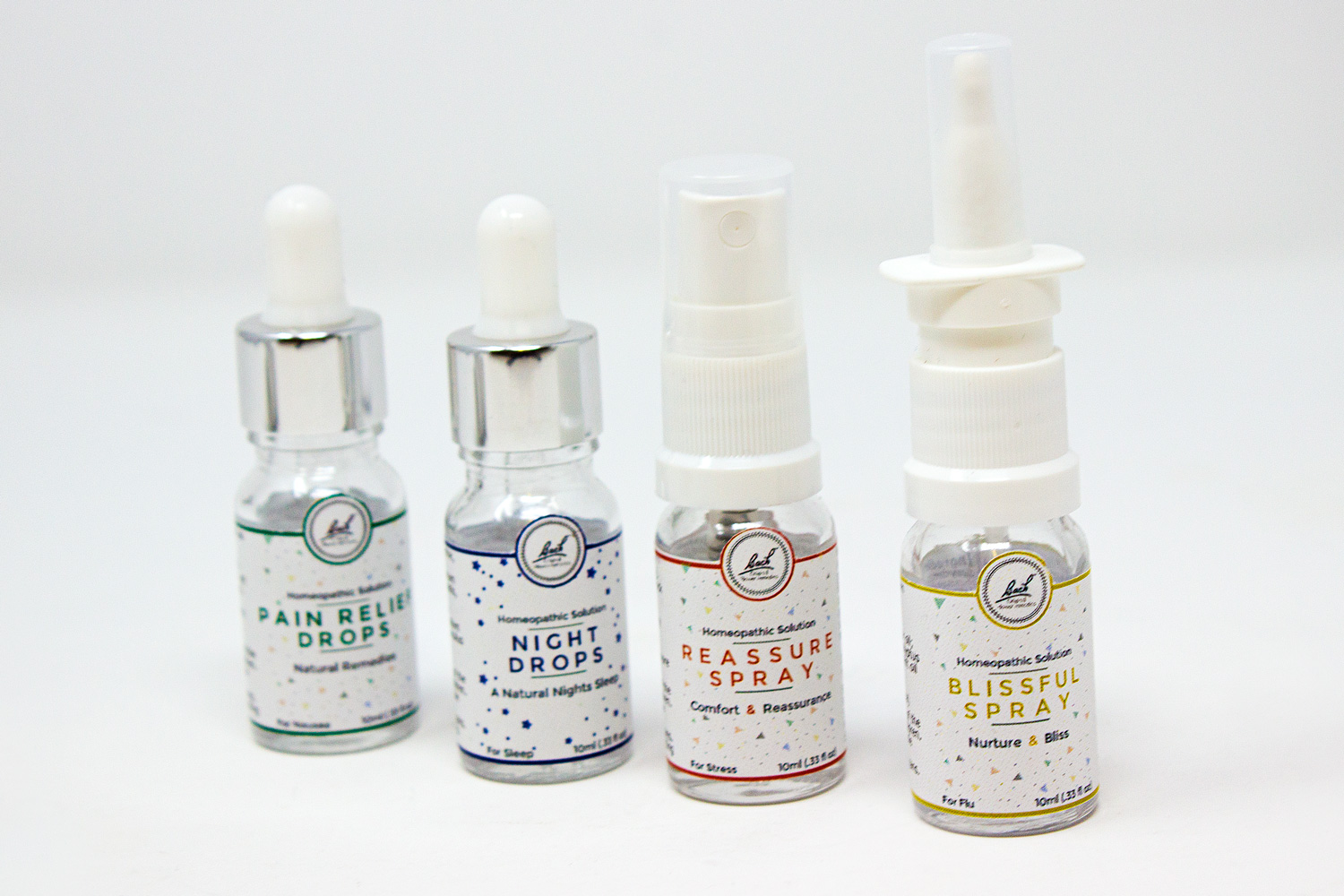
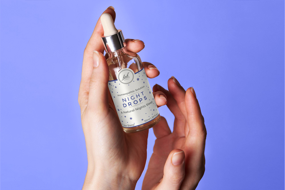
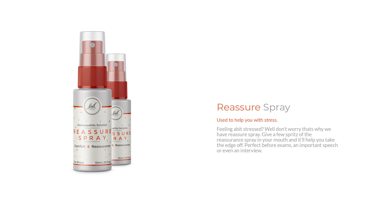
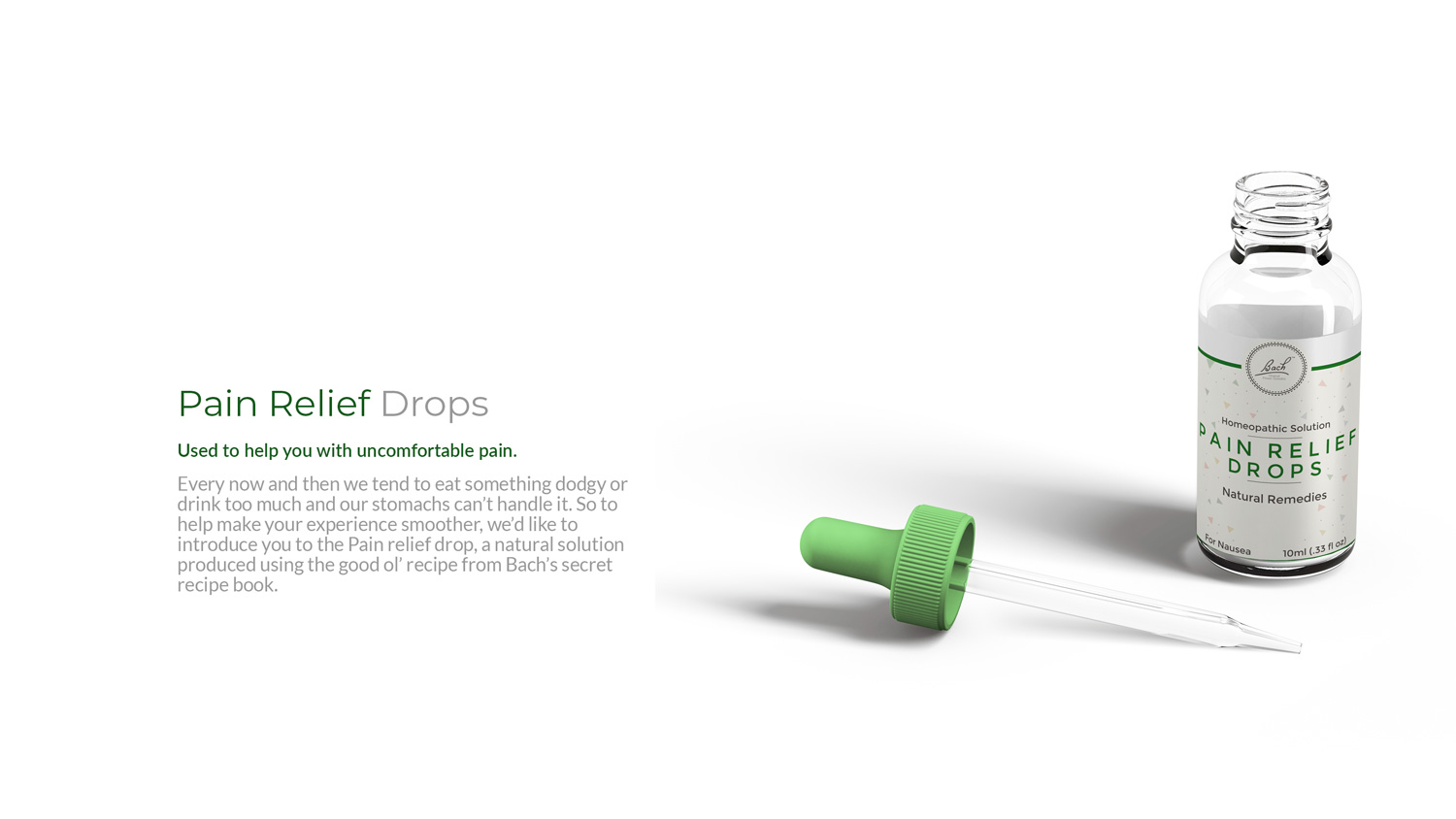
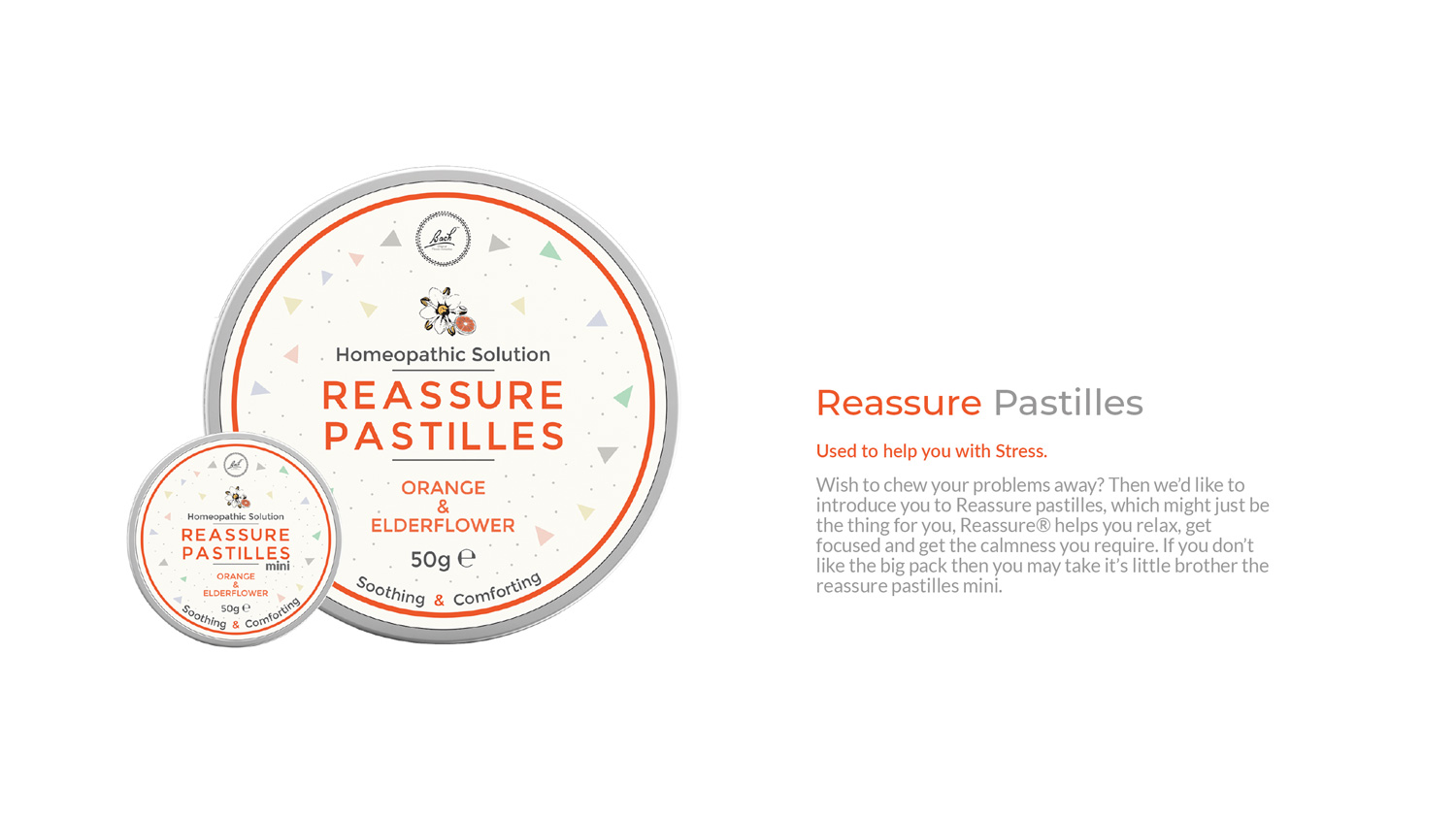
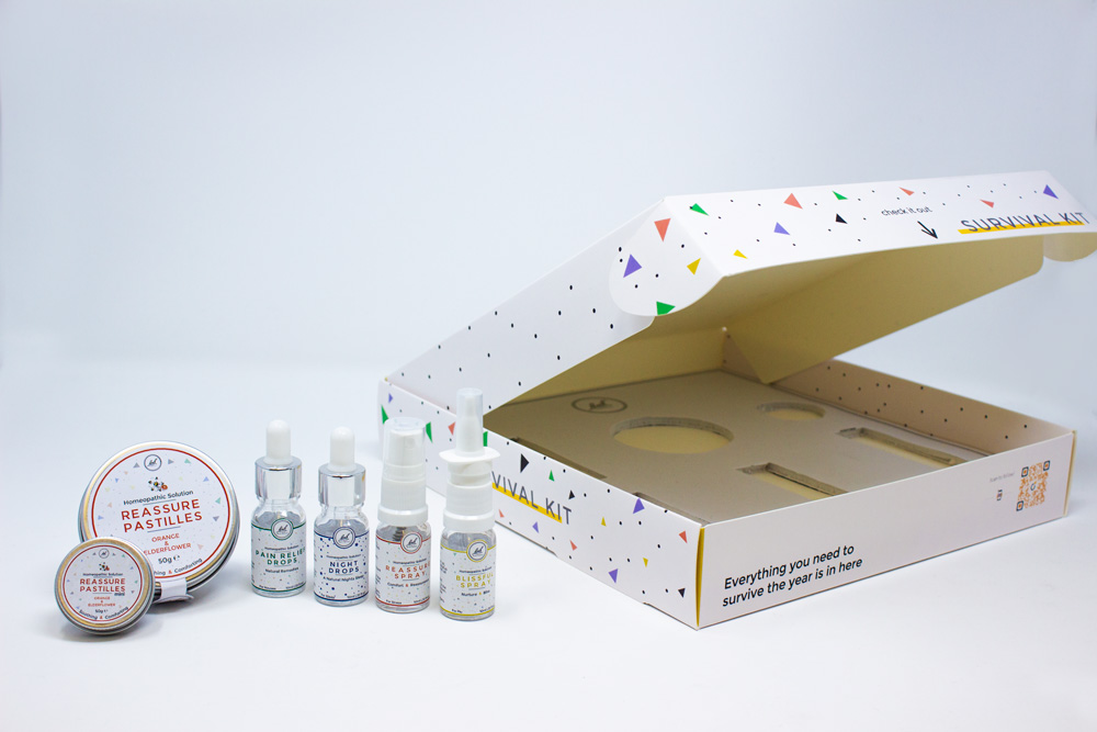
One of the challenges faced was the Bach lineup all shared the same colour & design causing customers to double check they’re purchasing the correct product. To remedy this confusion, I expanded the use of colour, so each ‘remedy’ had it’s own assigned colour.
Lets get to the paperwork.
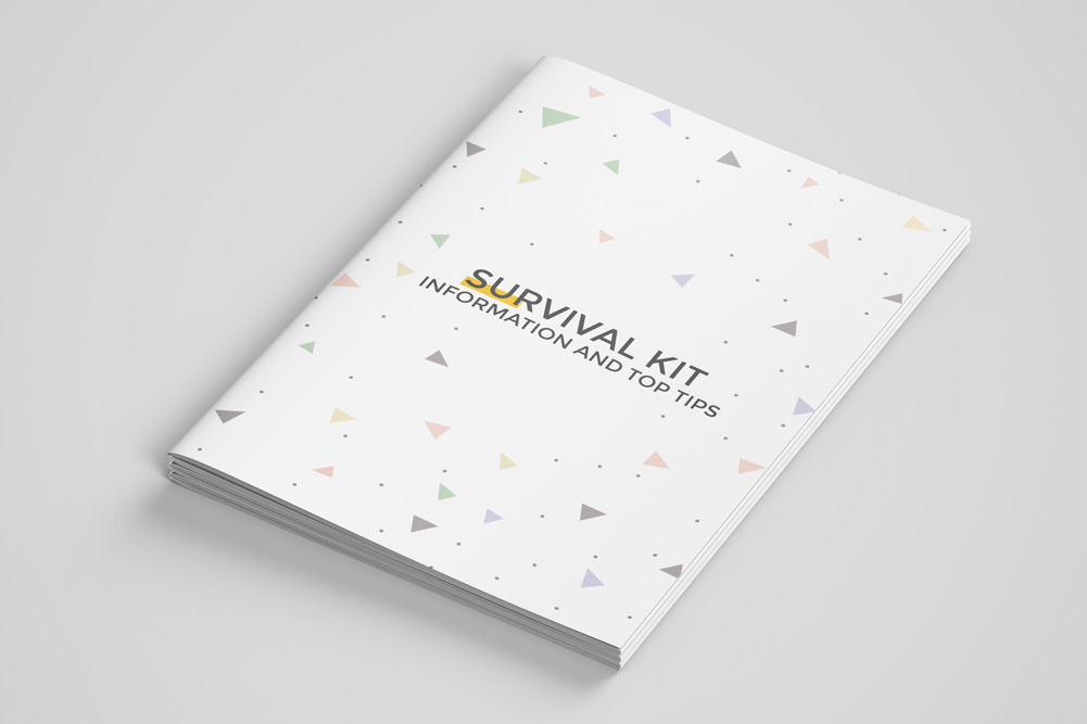
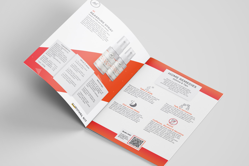
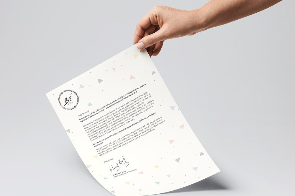
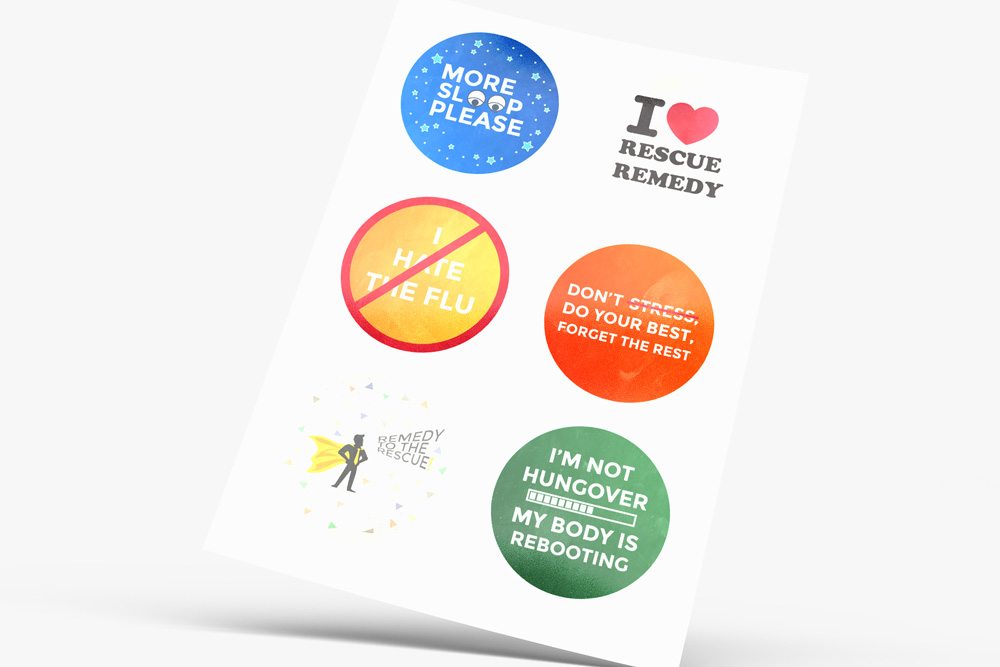
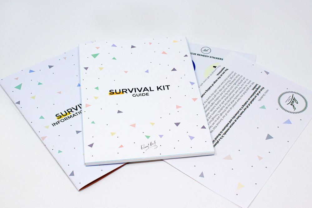
From the moment you open your box, you’re presented with a sleeve which includes a simple welcome letter, welcoming students to their new university. A small informative leaflet showcasing the benefits of Rescue Remedy, suggested home remedies users could apply to help calm themselves and… Yes we’ve also included Stickers too!
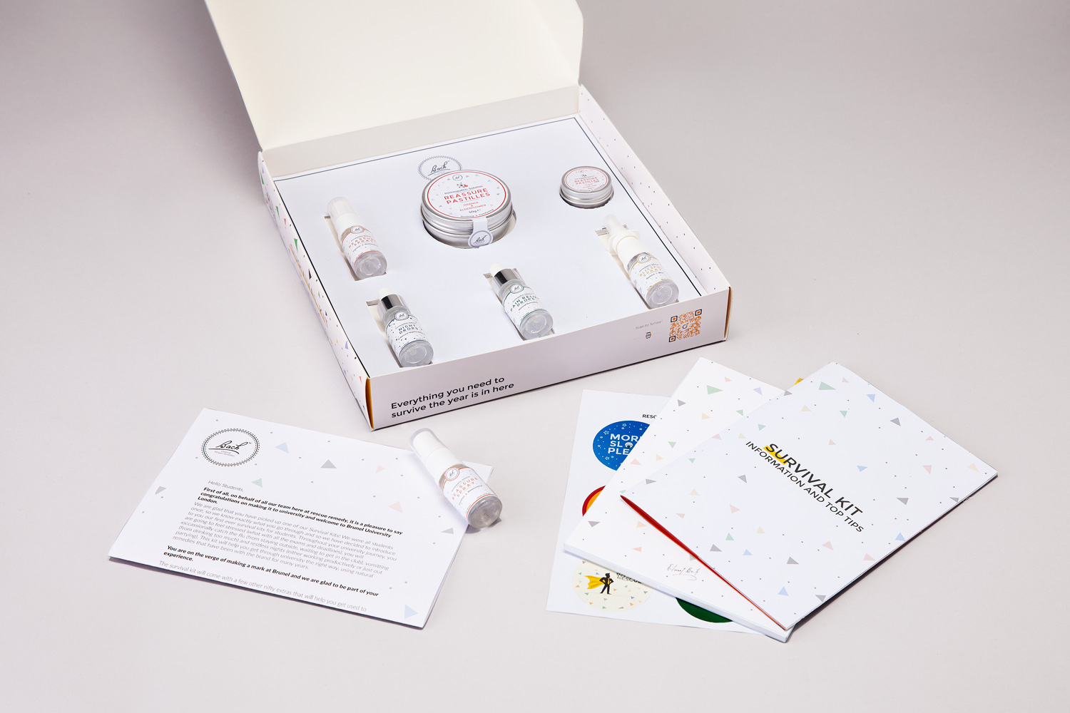
What's in the box?!
From the box to the welcome letter, students will have everthing they need to start the year right. The design remains consistent across the artefacts.
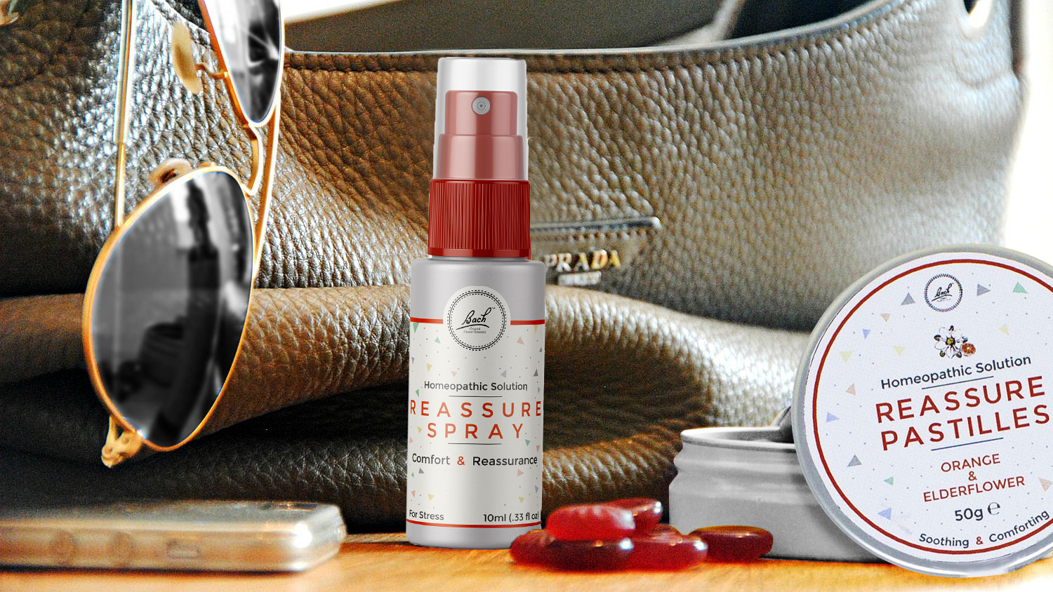
Out with the old in with the new...
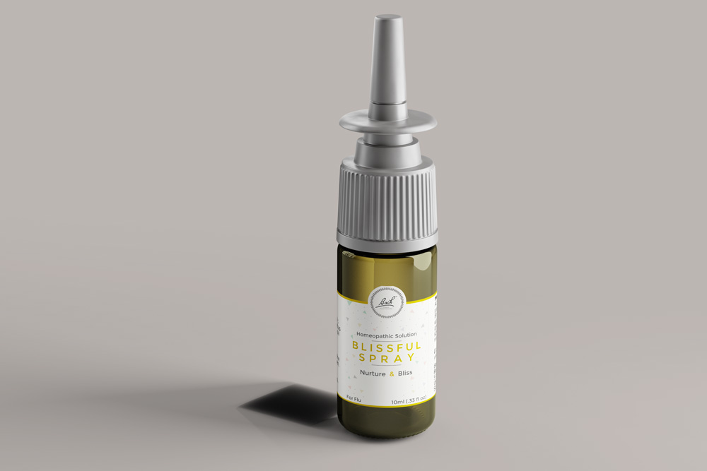
Less really is more when it comes to packaging and it’s amazing the power & impact of simplicity has on packaging.
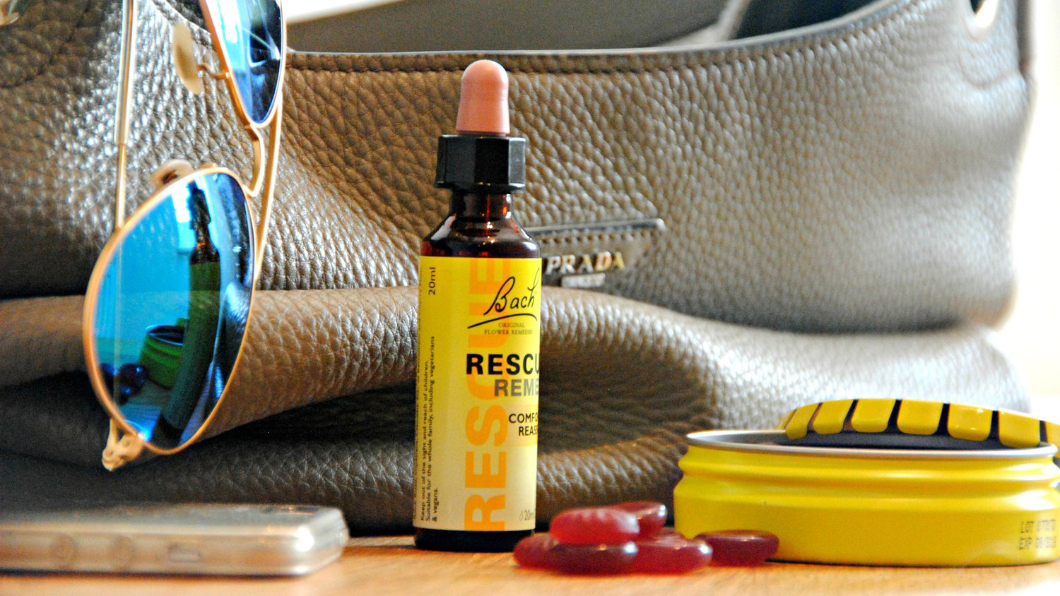
old
new
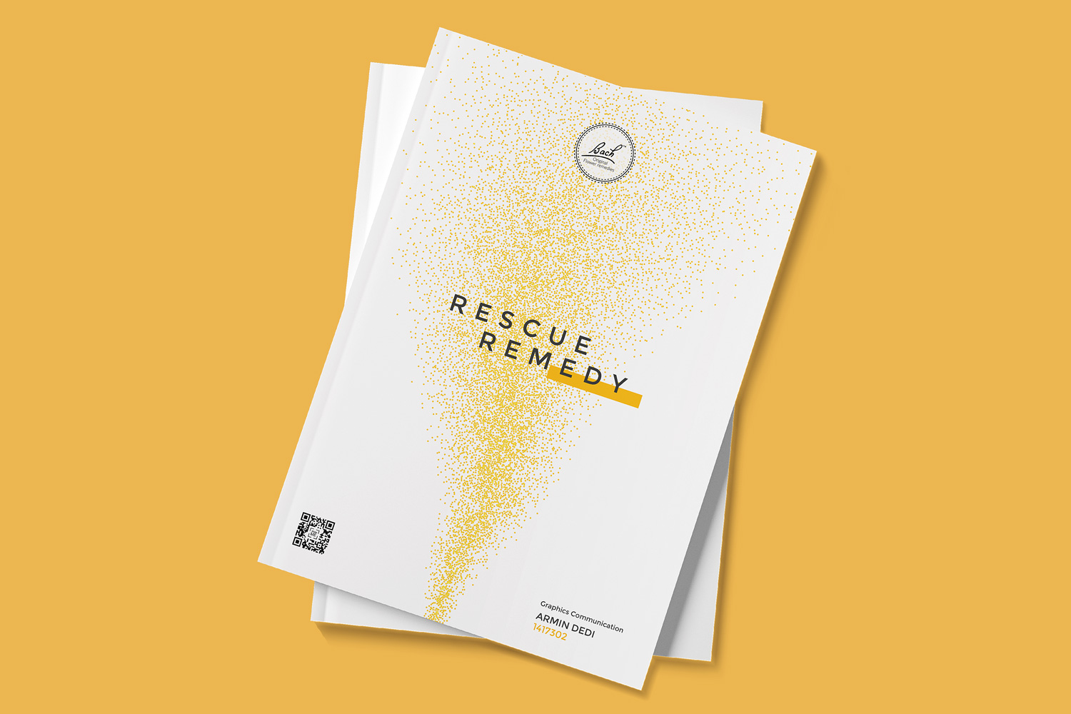
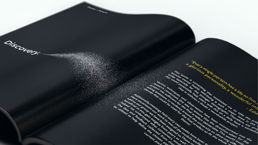
The Journal
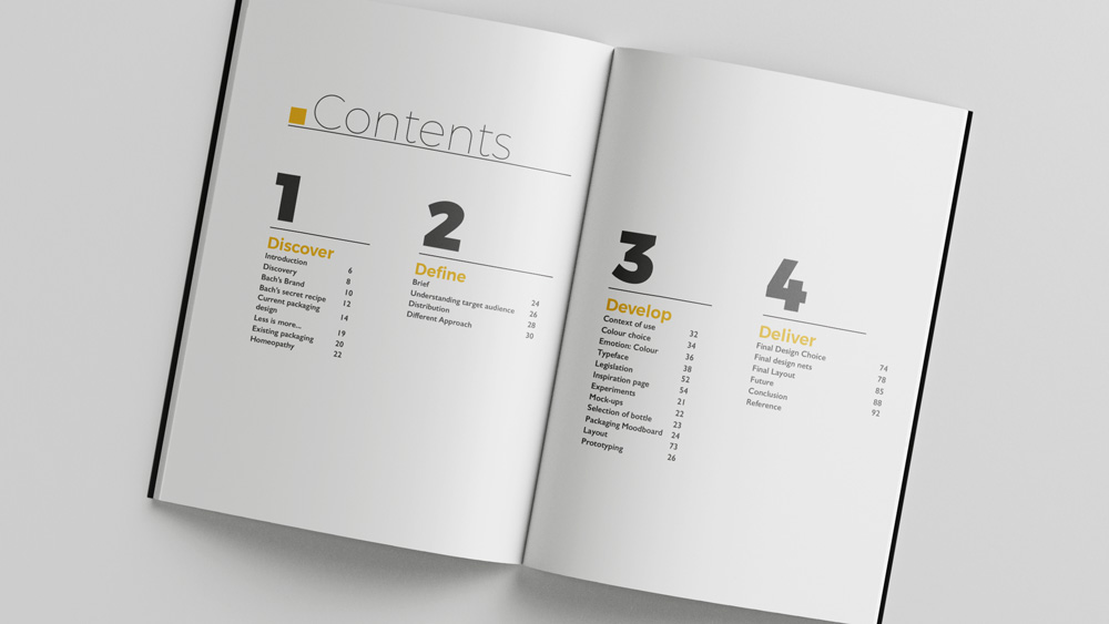
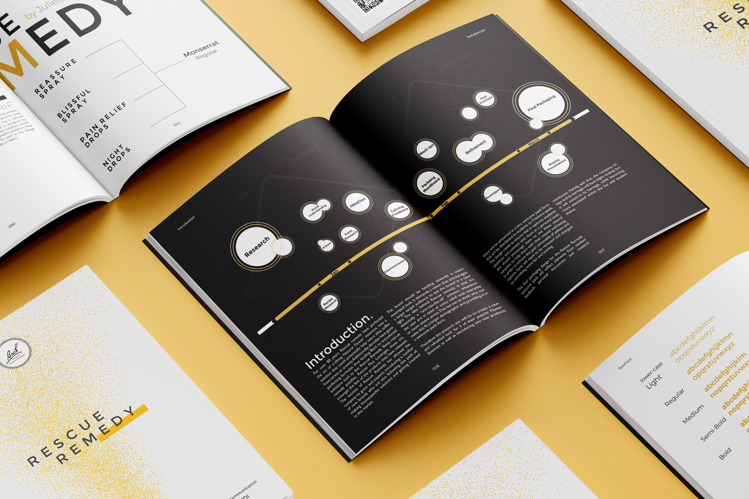
The ‘Workbook Journal’ was constructed to highlight the entirety of the project. This journal contains the journey, showcasing all the hard work and effort put into the artefacts from the re-branding to target market research.
