Pure Sensation
Deconstructing the brand elements to design a minimal, clear and jargon-free packaging design.
Pure Sensations believes that skincare product packaging should be simple, clear and jargon-free and we agreed. With the ambition to create natural cosmetic products specifically aimed at people with sensitive skin types.
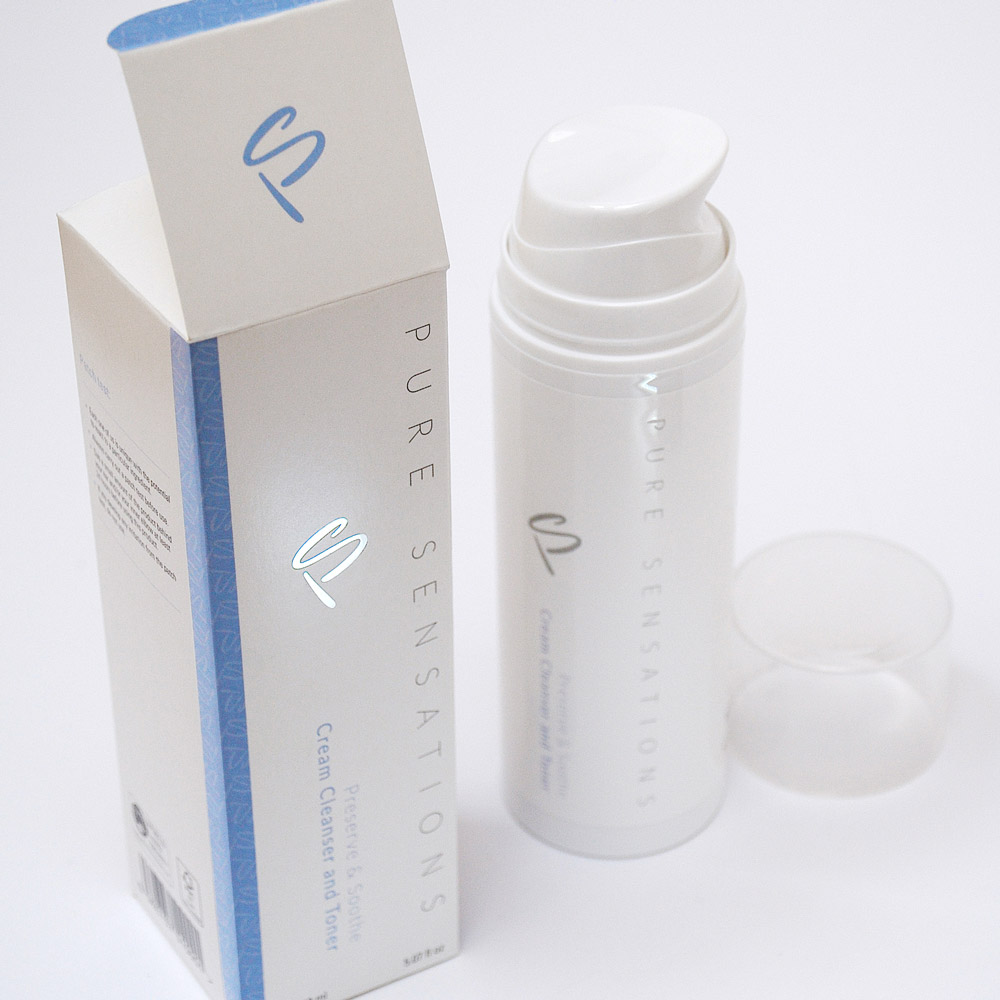
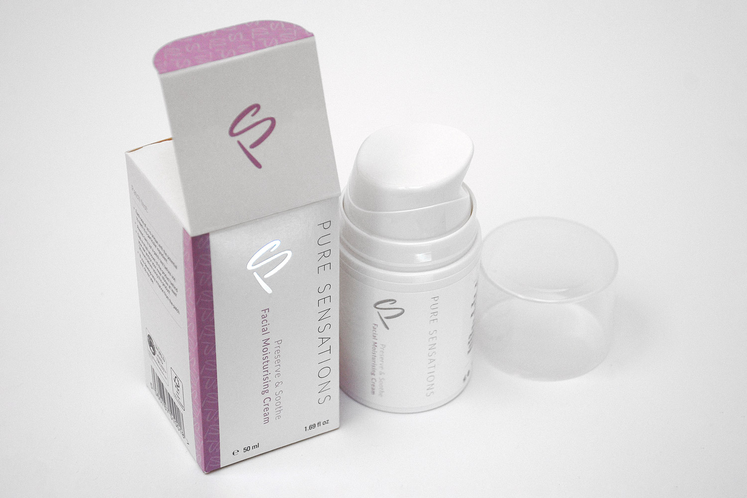
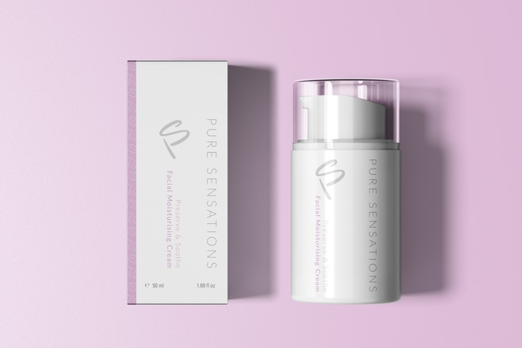
Understanding what the client needed, Right Angle has designed and produced a minimalistic and vibrant set of labels and outer packaging for Pure Sensations skincare range.
*Designed & contributed at Right Angle Creative.
Sector:
Retail, Fashion & Beauty
Services:
Packaging DesignBranding DesignVisual Identity
Pure Sensations
Sector:
Retail, Fashion & Beauty
Services:
Packaging DesignBranding DesignVisual Identity
Project Outcome:
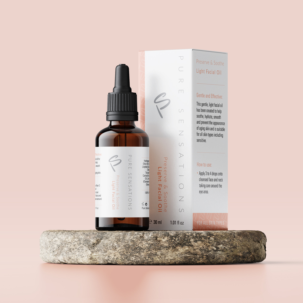
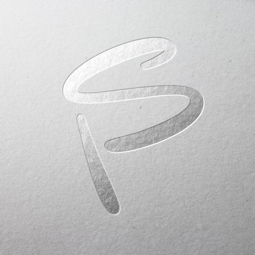
Our design solution involved crafting a sleek monogram by merging the letters ‘P’ and ‘S,’ imparting a contemporary yet ornamental touch to the brand’s identity. Right Angle has skillfully designed and produced a set of labels and outer packaging that strike a balance between minimalism and vibrancy for Pure Sensations’ skincare line.
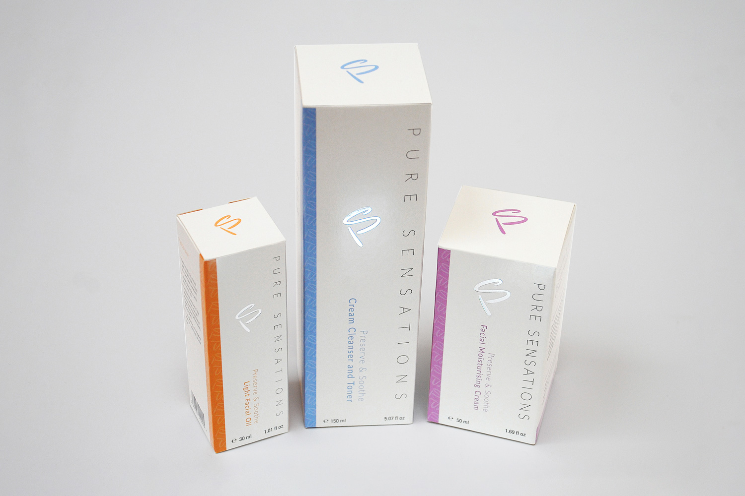
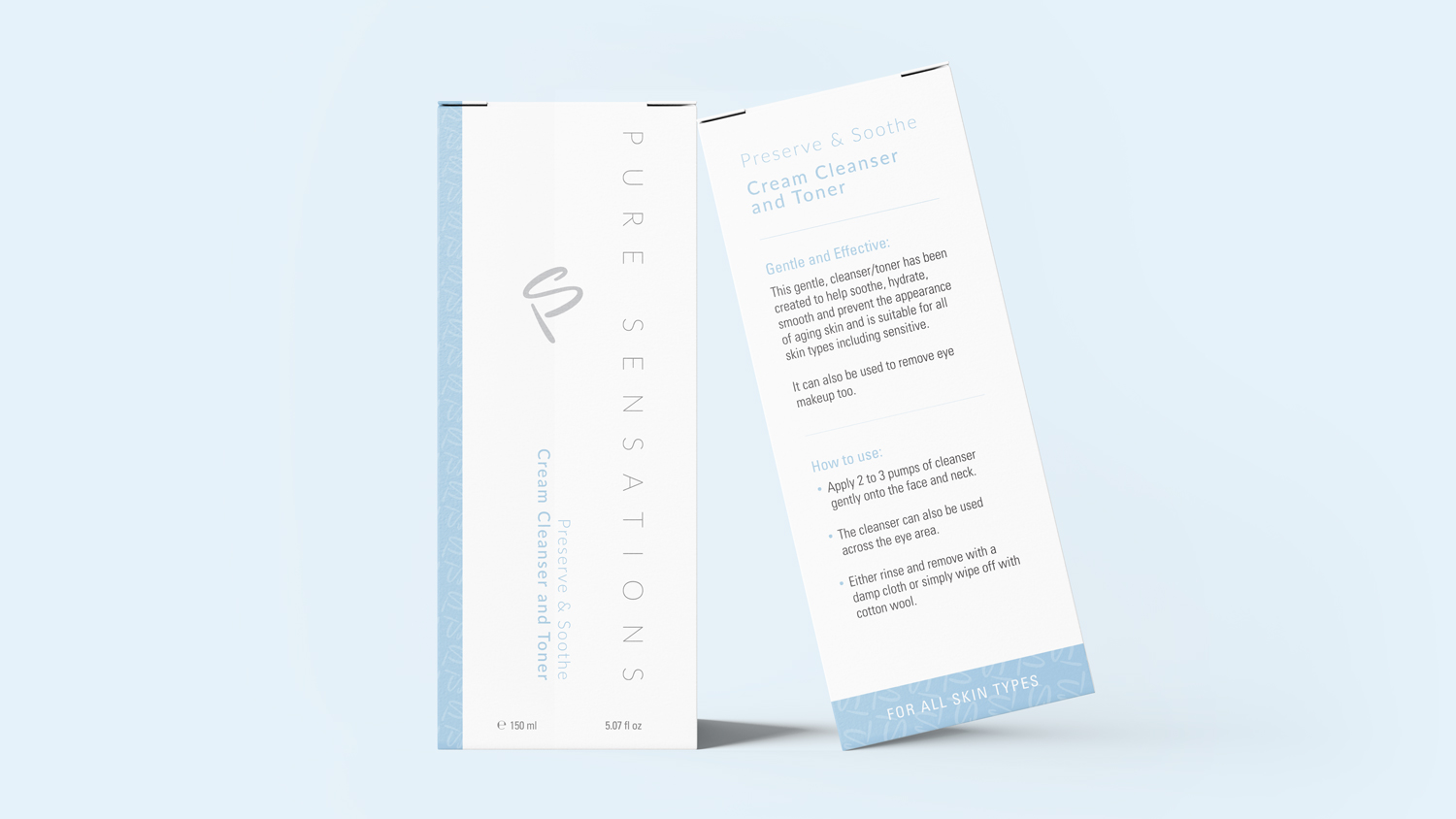
The gentle color palette comprising shades of blue, purple, and orange against a white backdrop lends a soft and feminine essence to the overall appearance. This visual language and packaging harmonize with the brand’s minimalist ethos, conveying a sense of cleanliness and tranquility.
The ‘PS’ symbol takes center stage as a repeating pattern adorning the outer box within an elegant pastel-colored band. Additionally, the primary ‘PS’ symbol logo graces the front of the box, featuring an exquisite silver foil finish that gleams when the product is handled.
